Nextgen
2023
Optimising Clinical Workflows to Reduce Documentation
Redesigned a healthcare documentation experience to help clinicians spend less time on administrative tasks and more time with patients.
Overview
Inside the U.S. Healthcare Ecosystem
The U.S. healthcare system relies heavily on Electronic Health Records (EHRs) to manage patient information, clinical documentation, prescriptions, and care coordination. However, physicians often spend a significant portion of their day documenting patient encounters, navigating multiple screens, and completing administrative tasks, leaving less time for direct patient care.
Problem
Two Critical Workflows, One Common Challenge
Healthcare professionals spend a significant portion of their day documenting patient encounters, leaving less time for direct patient care. Existing EHR workflows required navigating multiple screens, repetitive data entry, and manual documentation, increasing cognitive load and reducing efficiency. As a result, physicians often spent more time interacting with the system than with their patients.
Medication management, one of the most critical workflows in an EHR, also demanded considerable time and attention. Doctors had to search for medications, review patient history, verify allergies and dosages, and complete prescriptions accurately while ensuring compliance with clinical guidelines. The challenge was to streamline both documentation and medication workflows, reducing administrative effort while improving efficiency, accuracy, and patient safety.
Research
Understanding the People Behind the Problem
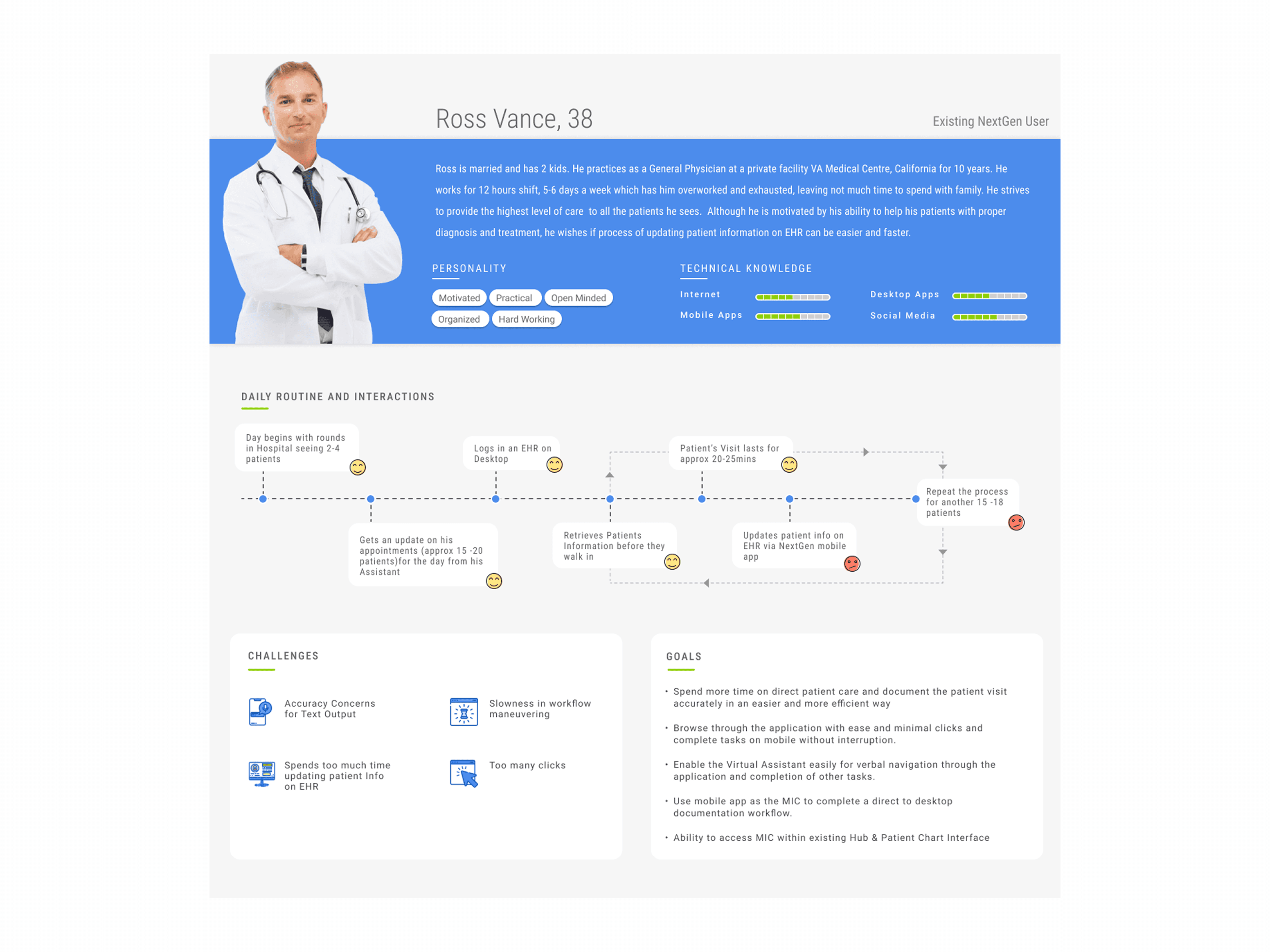
To better understand the needs, challenges, and daily workflow of doctors, I created a user persona based on research findings. The persona helped me empathize with users, identify key pain points, and make design decisions that addressed their real-world needs throughout the product.
Doctors work 12-hour shifts and see 15–20 patients every day.
Updating patient information on the EHR is time-consuming and repetitive.
Doctors want to spend more time with patients and less time on documentation.
They need a workflow with fewer clicks and simpler navigation.
Voice-assisted documentation can help speed up note-taking.
They prefer to complete documentation on mobile without interrupting their workflow.
Design audit
The Workflow Doctors Struggled With
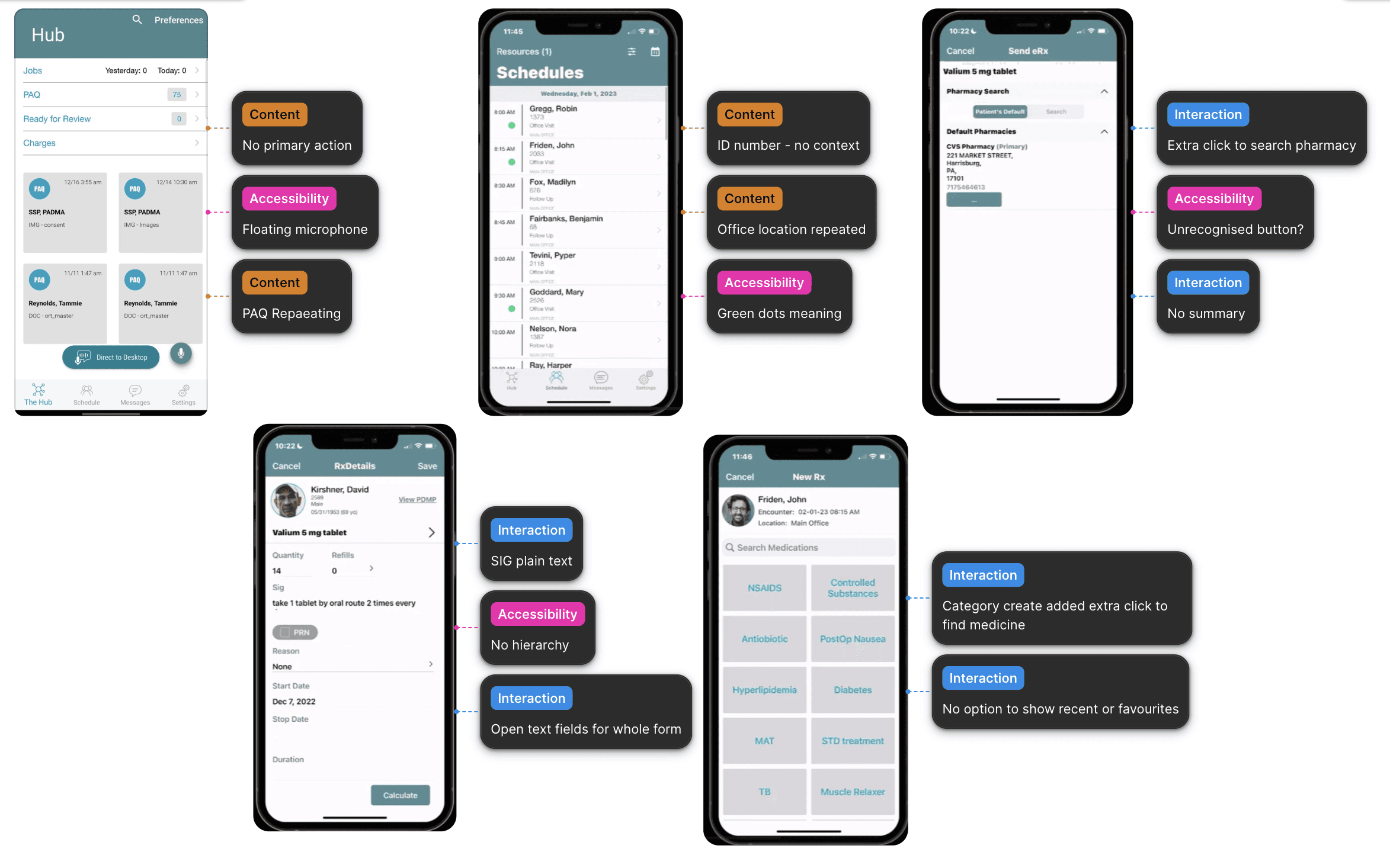
To better understand the existing experience, I analyzed the current workflow and identified several usability challenges. Doctors had to navigate multiple screens, manually enter repetitive information, and switch between different sections to complete documentation and prescribe medications. These fragmented workflows increased cognitive load, slowed task completion, and reduced the time available for patient care, highlighting the need for a more streamlined and efficient experience
Design
From Problems to Purposeful Solutions
Design Decisions
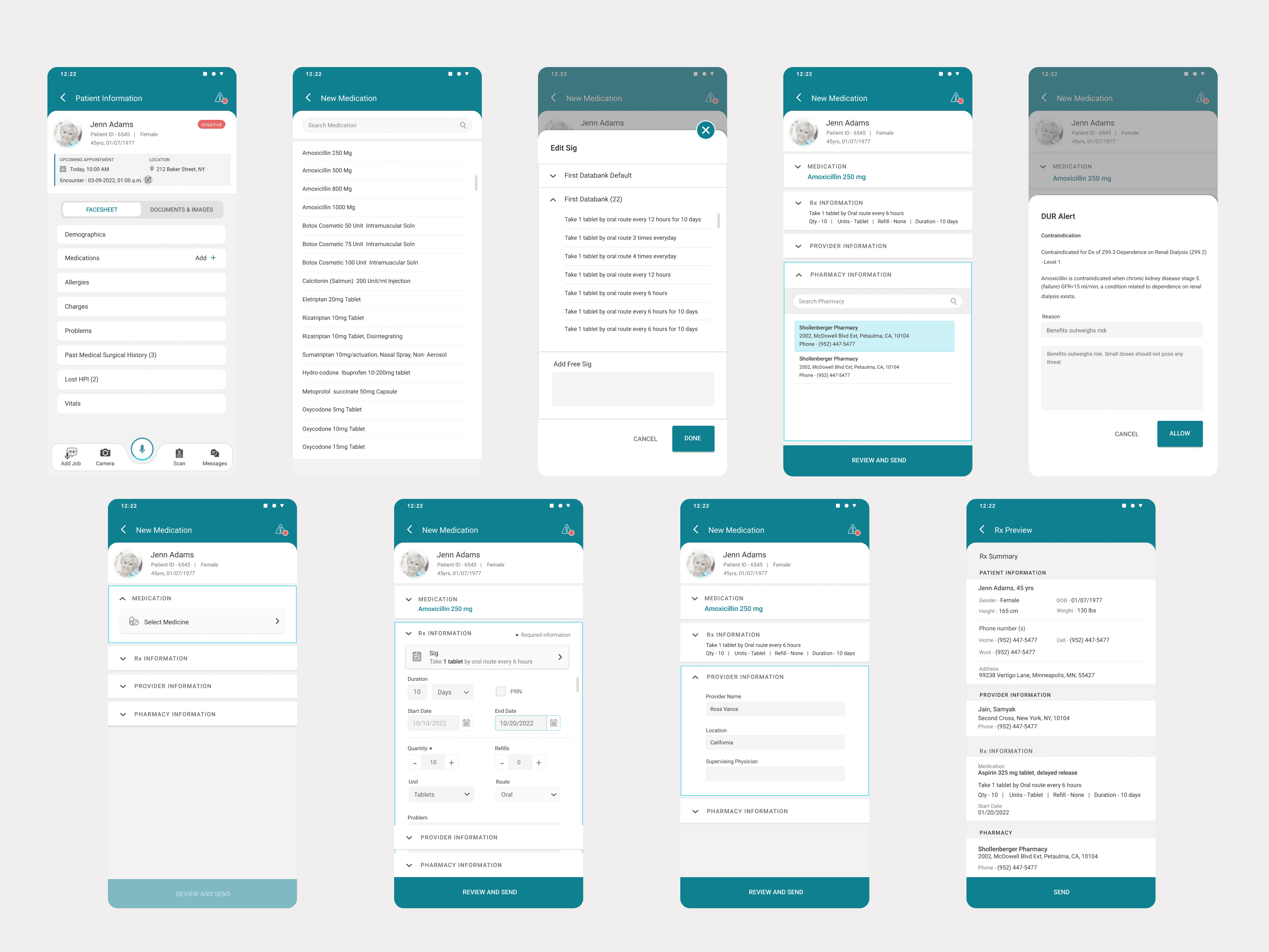
Context before action — Added a Patient Information screen at the start (allergies, active meds, history) since a physician must know who they're treating before prescribing.
Search replaces browsing — Replaced the category-grid (NSAIDS → drug) with direct search, since regular prescribers already know the drug name.
Structured inputs over free text — Sig field now pulls from First Databank's validated library instead of free text; quantity/refills use steppers, route/unit use dropdowns — framed as a patient-safety decision, not just UX.
Progressive disclosure — Provider and Pharmacy sections made collapsible to cut cognitive load while keeping info available.
Forced acknowledgement for drug alerts — DUR Alert uses a modal (Cancel/Allow) instead of a dismissible toast, since passive alerts get ignored in busy clinical settings.
Confirmation before an irreversible action — Added the Rx Preview screen so the full prescription is reviewed before sending (previously only the pharmacy address was shown).
Direct to Desktop
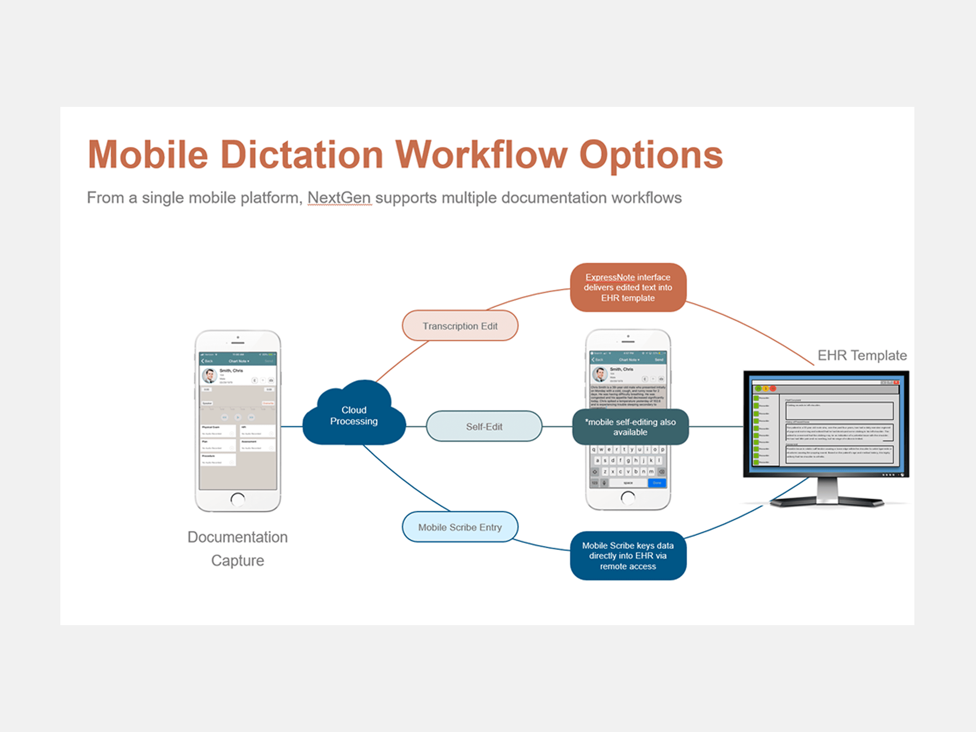
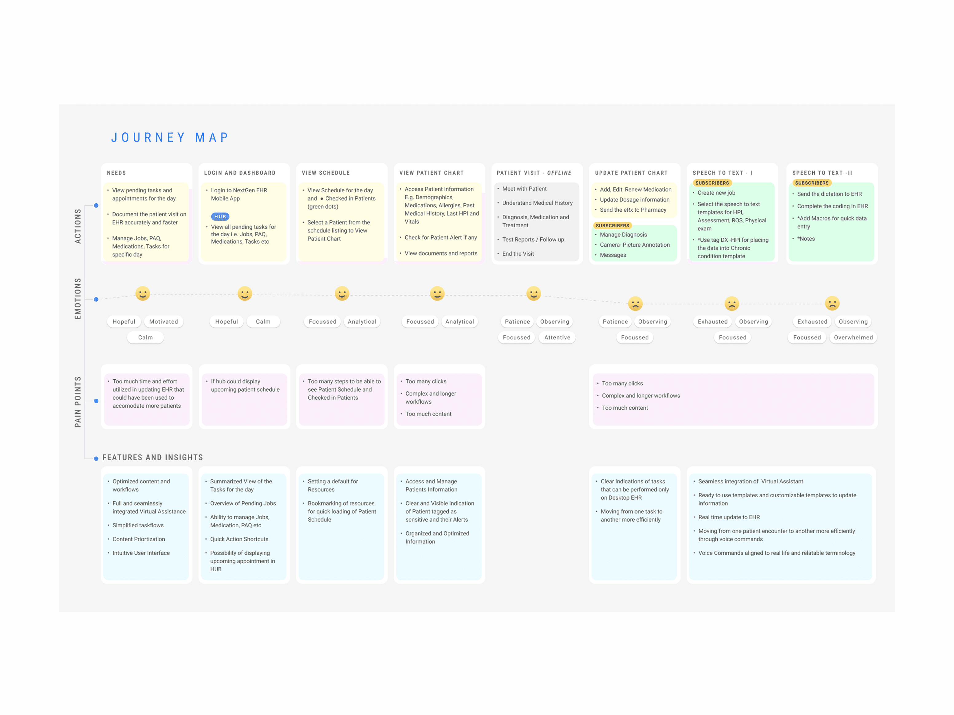
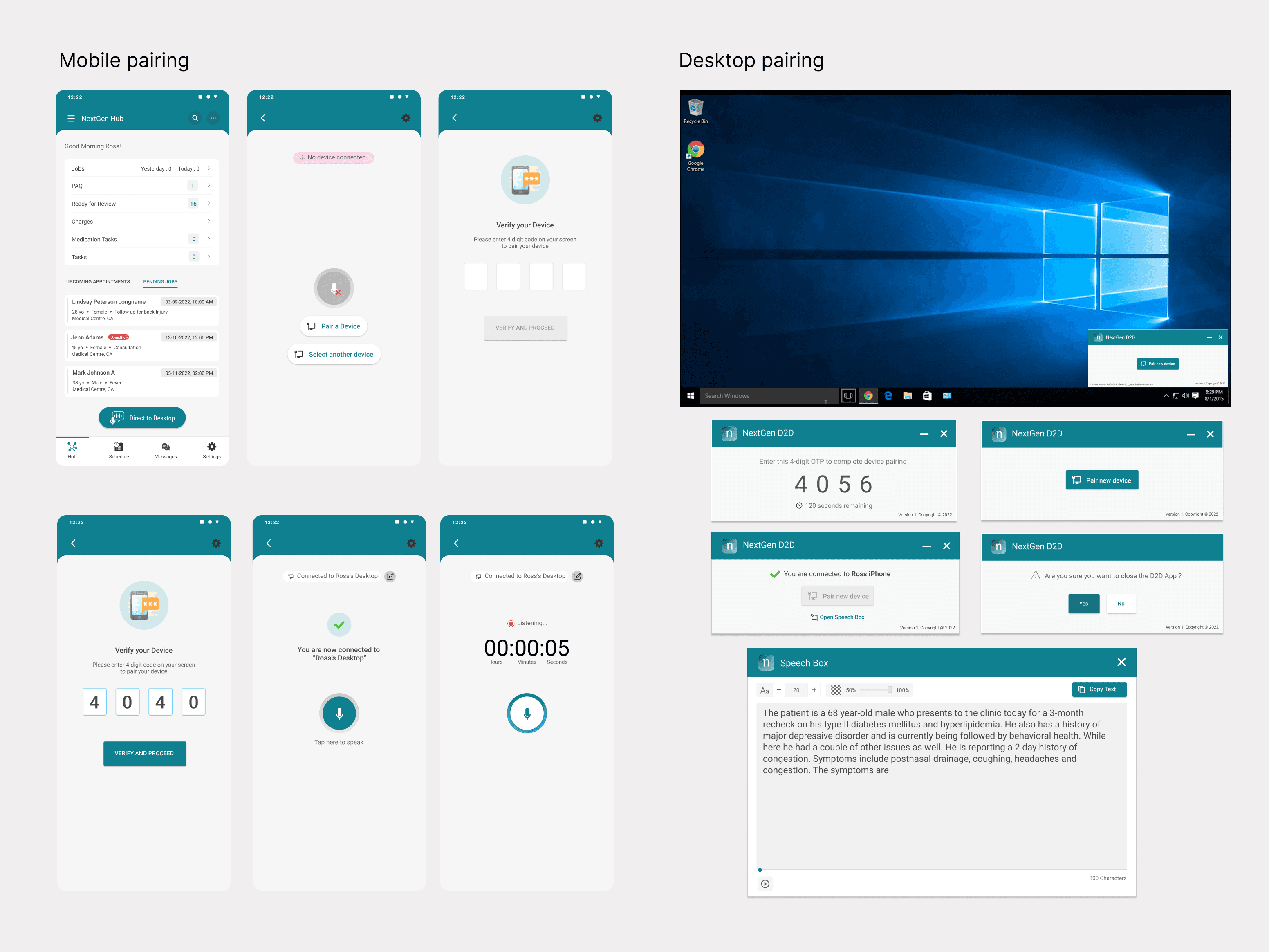
One of the deepest pain points in Ross's journey map was the final stage: Speech to Text. Even after completing a patient visit, documenting it accurately into the desktop EHR required switching contexts, retyping notes, or wrestling with unreliable voice tools. The Direct to Desktop (D2D) feature solves this by turning the mobile app into a microphone for the desktop — paired via Bluetooth OTP, dictated on the phone, transcribed live on the desktop EHR.
Projected Outcome
Helping Doctors Focus on What Matters Most
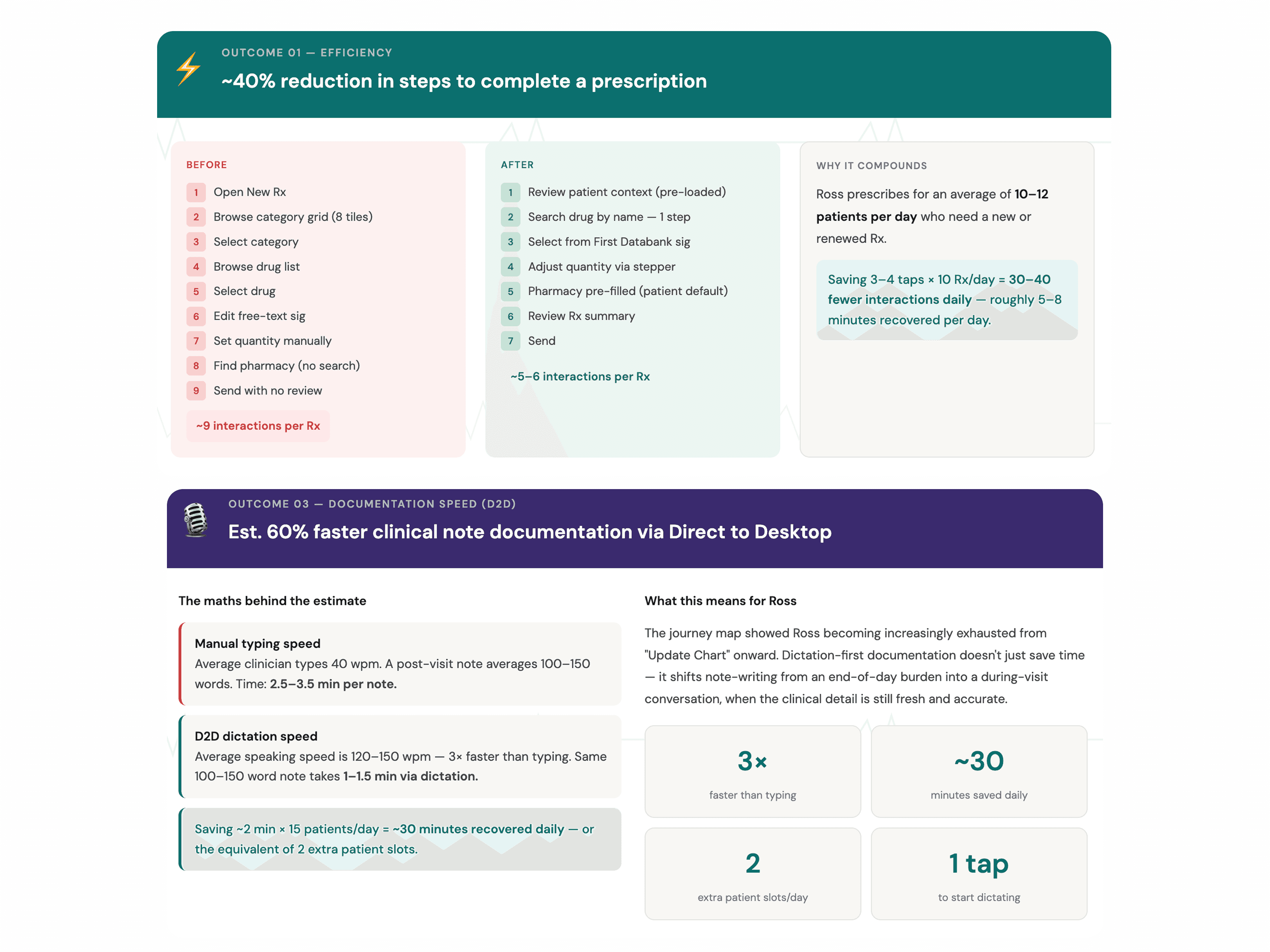
These outcomes are projected based on the friction points addressed, the reduction in workflow steps, and improvements to critical clinical tasks. They represent measurable hypotheses that would be validated through usability testing and post-launch product analytics.
Learning
This project strengthened my understanding of healthcare UX by showing how even small workflow improvements can have a meaningful impact on clinicians' daily routines. I learned the importance of designing around real user needs, balancing efficiency with patient safety, and ensuring that streamlined workflows continue to meet clinical and regulatory compliance requirements. Most importantly, I realized that great healthcare design isn't just about creating better interfaces—it's about helping doctors spend less time on documentation and more time delivering quality patient care.