Tata Communications
2025
Simplifying Configuration and Monitoring to Improve Enterprise Efficiency
Building SASE from 0 → 1 Designing Tata Communications’ first SASE experience SASE brings networking and security into one platform. At Tata Communications, we were building that experience from scratch. I worked across 7 core flows, from onboarding and configuration to monitoring, for both Tata Ops and Customer Admins.guration, improve monitoring visibility, and help admins understand their network faster during everyday operations.
Overview
Making network complexity easy to understand
The Impact
The design focused on improving clarity across configuration and monitoring through intent-based navigation, tab-based architecture, and a single-pane-of-glass dashboard. The result made everyday network operations easier to scan and act on, while sequencing complex tasks — like WAN configuration and policy management — into structured steps admins could follow without prior networking expertise
Challenge
Enterprise admins had no single place to see or manage network
There was no existing product or interaction model to build on.
Users had to work with customers, Service Edges, devices, WANs, policies and security data, all within one platform.
How do we make a technically complex system easy to navigate without hiding the complexity expert users need?
Research
Mapping the landscape before designing the platform
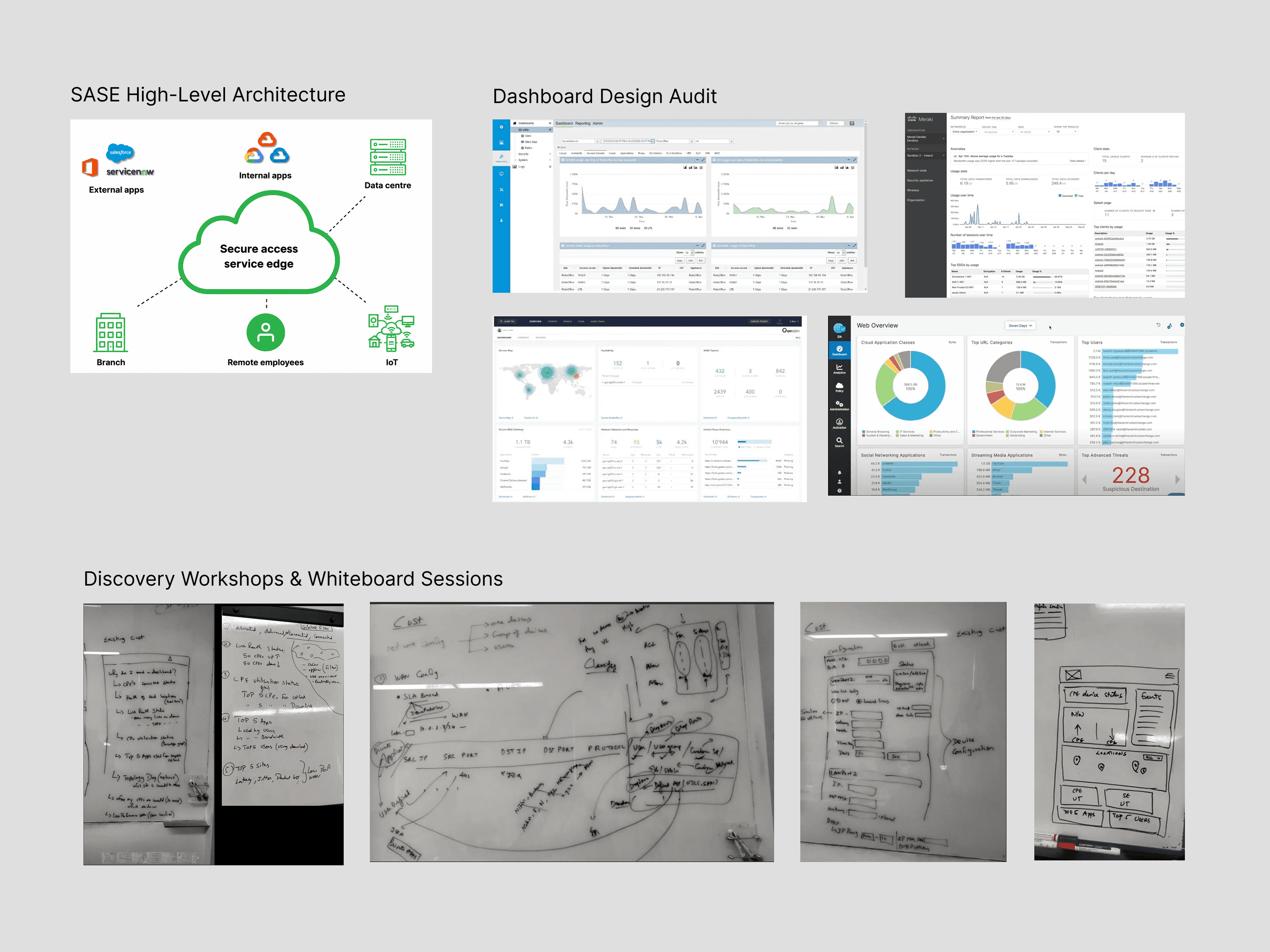
To understand what enterprise admins actually needed from a platform that didn't yet exist, I conducted a competitive analysis of three leading SASE vendors and ran a structured discovery workshop with Tata's internal security and operations teams. The research focused on how admins would need to configure devices, monitor network health, and act on issues - surfacing requirements for dashboards, device configuration, and network policy before a single wireframe was drawn.
Understanding the workflow
I mapped the experience into three connected stages:
Onboard → Configure → Monitor
Three distinct user types — internal operations, tenant admins, and end users — needed the same platform to work in very different ways
Configuration was genuinely complex, but the real problem was sequence, not the complexity itself
Monitoring metrics often wouldn't exist yet post-provisioning, so empty states needed as much design attention as data-rich ones
Admins needed an audit trail to answer "did someone change a rule?" — accountability was missing entirely
Ideation
Exploring interface directions

Exploring different dashboard concepts across leading SASE platforms, focused on hierarchy, network status visibility, and clearer everyday monitoring workflow
Testing interaction flows early
I validated the flows through design reviews, stakeholder feedback and iterative walkthroughs.
Feedback helped refine the information hierarchy, configuration patterns, tables and navigation.
Designs
Refining the dashboard experience
Getting a customer onto SASE
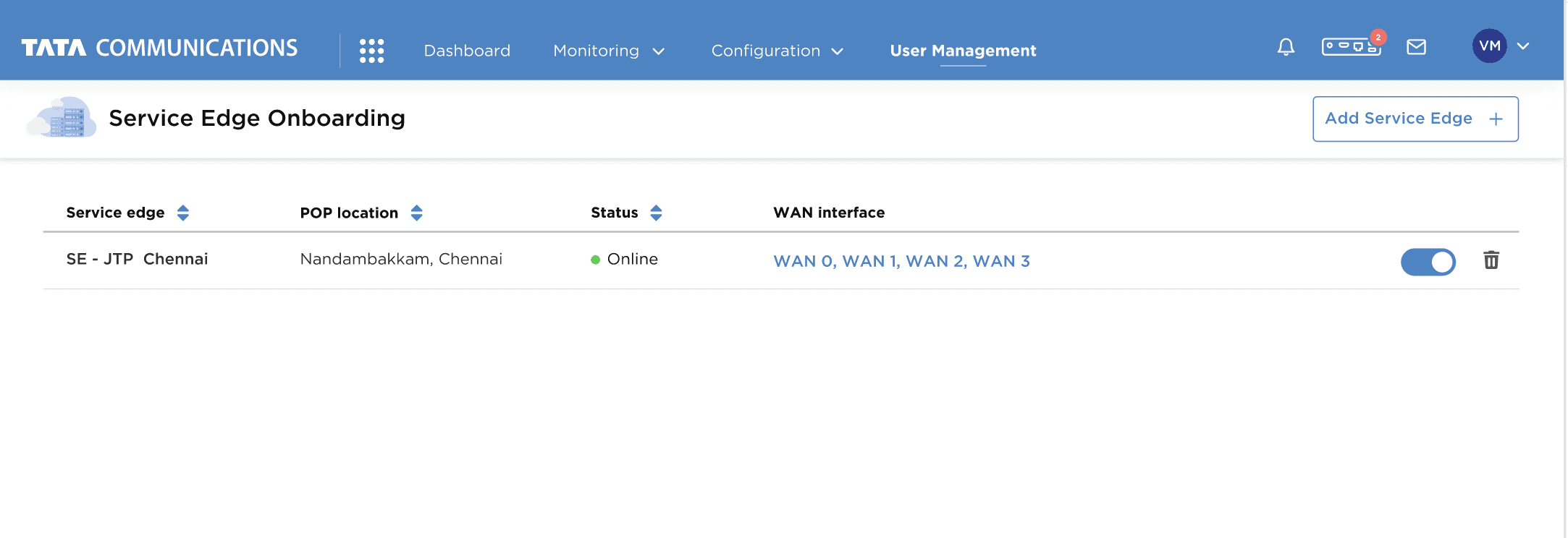
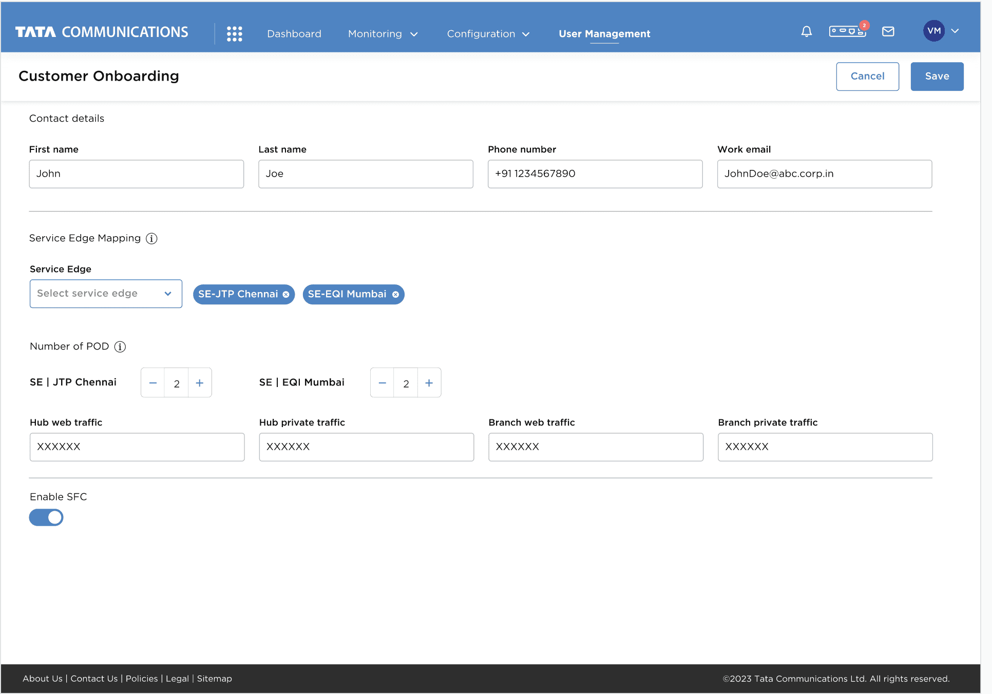
Before a customer could use SASE, Ops had to first set up the Service Edge and map the customer to it. The tricky part was that these were experienced operators—they didn't need a guided, step-by-step onboarding experience. They needed speed, visibility, and control.
I explored a wizard and progressive flow, but both introduced more navigation and hid information they needed to see together.
So I kept onboarding on one page and focused on removing unnecessary manual work.
One constraint remained: customer details couldn't be fetched from the backend, so Ops still had to enter them manually. Site and device mapping was also handled through backend provisioning, so I kept those steps out of the UI.
The goal wasn't to make onboarding simpler. It was to make a complex provisioning task faster for people who already understood it.
02 — Configuration: Designing around how experts work
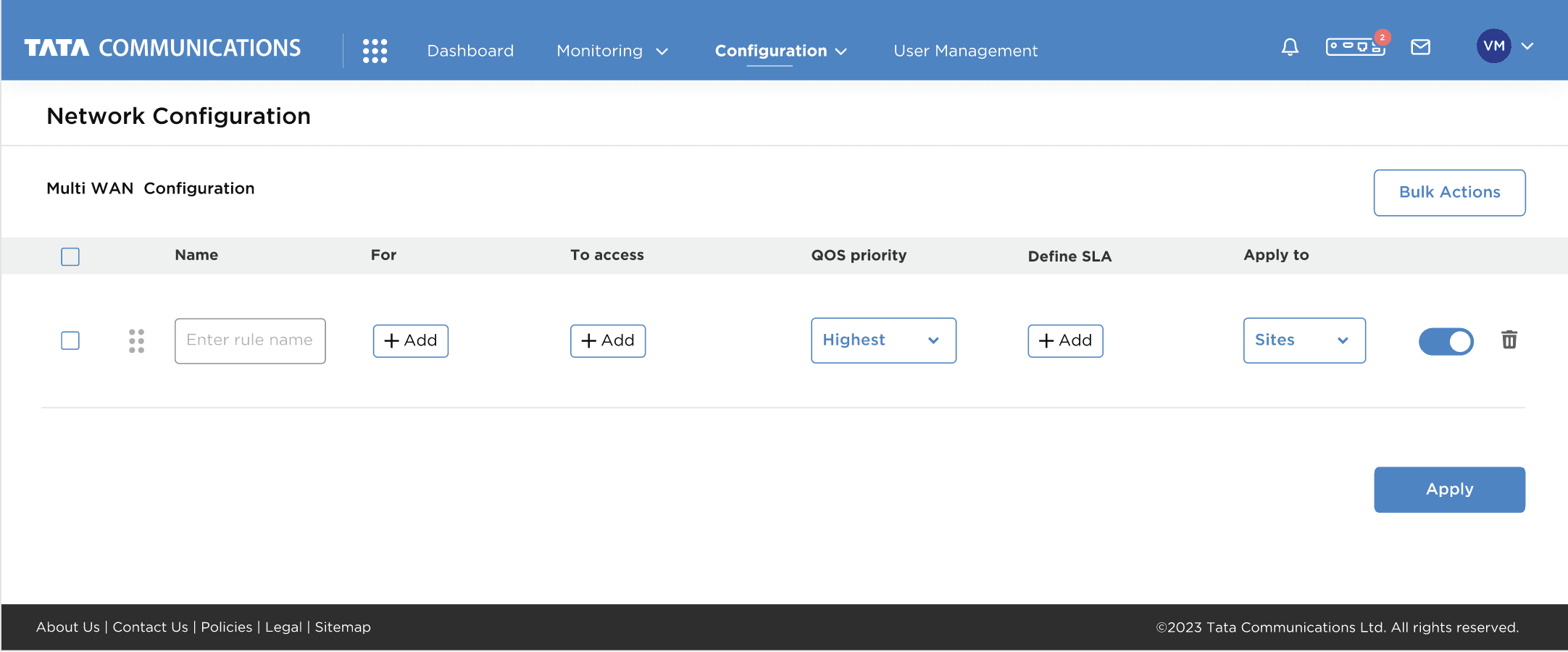
After onboarding, the same interface had to support device and network configuration—from multiple WAN connections to rules, QoS, SLA and site-level settings. The challenge was keeping all this complexity manageable without slowing down an experienced user.
From discussions around the Ops workflow, one thing was clear: configuration was a task users needed to work through quickly, while keeping the surrounding context visible.
I explored three directions:
Separate pages → more space, but users had to navigate back and forth.
Modals/new windows → kept the main page intact, but made complex configuration harder to compare and maintain context.
One-page configuration → denser, but kept related information together.
There was stakeholder pushback on moving configuration into separate screens, reinforcing the need to keep the workflow together.
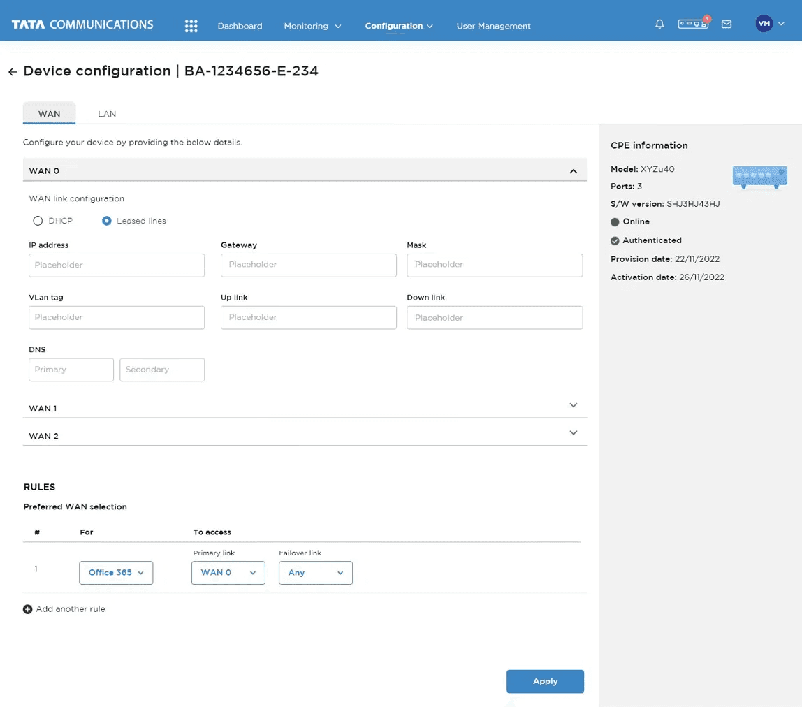
So I leaned into the one-page model and structured the complexity instead of hiding it:
Device: tabs + expandable WAN sections to manage multiple connections without a long scroll.
Network: a table that keeps rule attributes—access, QoS, SLA and sites—visible together.
Bulk actions: support repeated configuration at scale
Monitoring: From network overview to site-level visibilityOnce the network was configured, the next challenge was making a distributed SASE environment easy to understand at a glance. Users needed to monitor overall network health while still being able to investigate what was happening at an individual site.
I explored how to balance overview and depth—what belongs on the dashboard, and what should appear only when a user drills into a site.
So I built a layered monitoring experience:
Dashboard → network-wide health, utilisation, apps and users
Site monitoring → deeper visibility into a specific location
Device / Network / Security → detailed operational dataThe dashboard gives users the big picture first, while site-level views let them move deeper without losing the context of the network they came from.
The principle: Start broad, then let users go deeper when they need to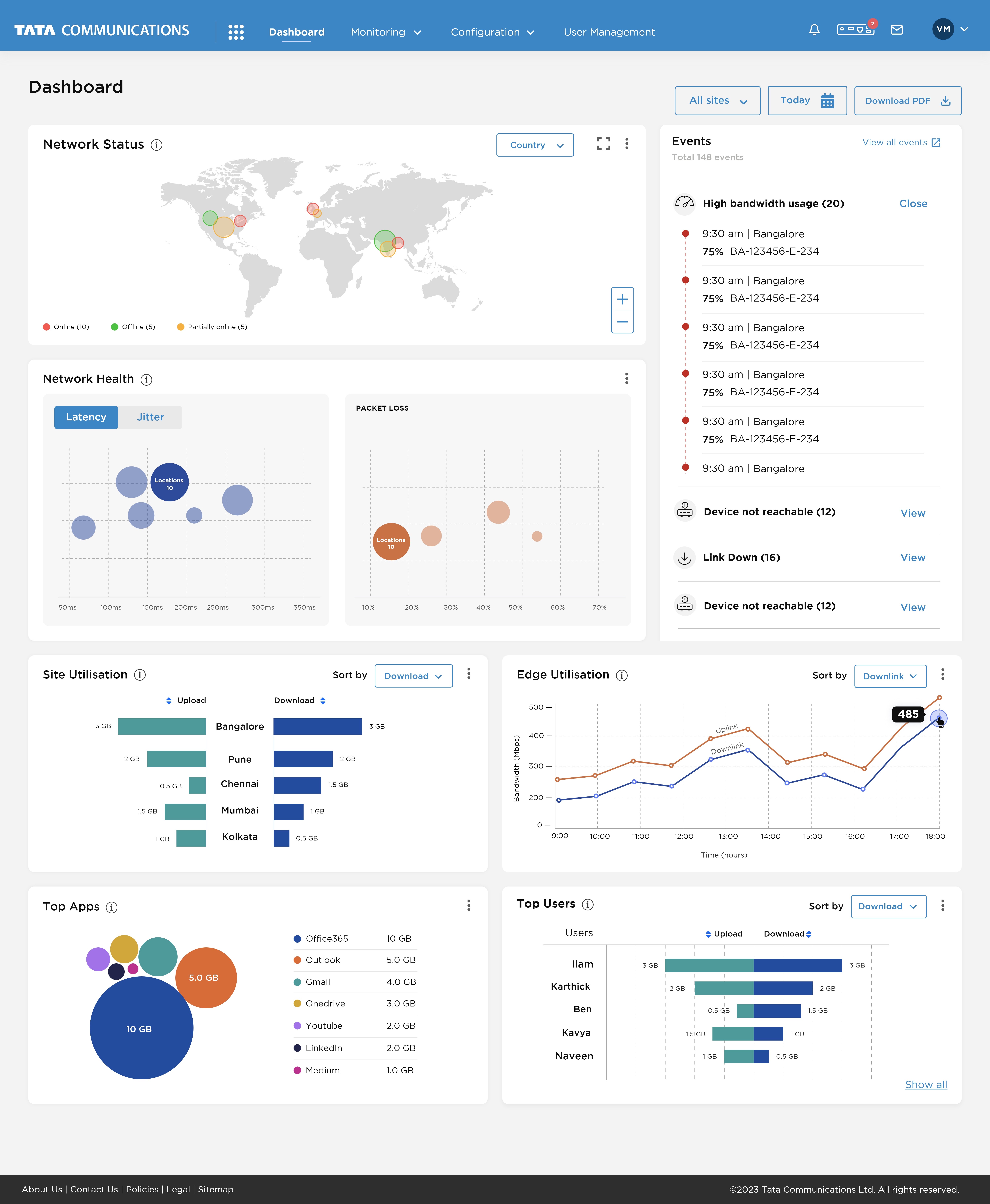


Future enhancements
Where this goes from here
Measuring success
The product was launched, and support tickets became our first source of post-launch feedback. They revealed a few recurring behaviours:
Empty data states — users weren't sure whether data was missing, loading, or simply unavailable.
Configuration density — screens became difficult to scan once users added 5–10+ rules.
Data interpretation — metrics like latency weren't always self-explanatory to use
For a fuller post-launch evaluation, I would look at:Task completion · Time-on-task · Configuration errors/rework · Support dependency · Tasks completed without assistance