Tata Communications
2026
EDP - Faster Onboarding, AI-Powered Insight, AI-Assisted Design
End-to-end design for EDP, Tata Communications' greenfield edge platform Self-serve 30-day trial through to role-based dashboards Distinct views for executives and operations from one shared data layer AI powered dashboard insight and sped up early design exploration Figma and design judgment shaped what shipped
Overview
What is EDP?
EDP is a unified, self-serve platform from Tata Communications bringing CDN, security, and edge compute together in one portal. As the sole UX designer, I owned the trial and dashboard experience end to end, working from PRD requirements and stakeholder input across product, engineering, and CXO teams.
Problem
Building Trust with No Track Record
Here are the key problems to tackle in Phase 1:
Merging three products into one - CDN, security, and edge compute had to feel like a single platform
Starting from scratch - no existing platform or patterns to build on
Different users, different needs - implementers, monitors, and executives all wanted different things from the same data
No second chances - 30-day trial, no SLA, no support - trust had to be earned fast
No existing usage data - designed from stakeholder input and PRD, not past behavior
Depth vs. self-service - powerful enough for technical users, simple enough to configure alone
Designing trust, not just usability - users were deciding whether to hand over real infrastructure
Understanding
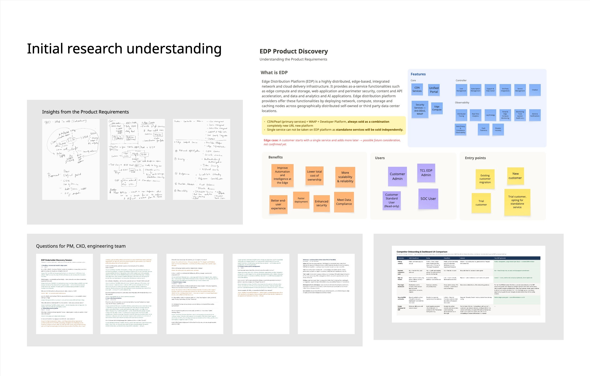
What, when, where and everything around
Insights gathered from multiple meetings with PM, CXO, VP and the developers team
Business and ops users need entirely different info from the same data — one dashboard couldn't serve both
CDN alone isn't sold as a standalone offering — must be bundled with WAAP or dev platform
Ops couldn't tell urgent vs. handled security events at a glance
Ops had to juggle traffic, security, and edge compute separately
Real fear of losing trial configuration when converting to paid
🔹 AI used here: synthesized notes from these sessions with AI to surface patterns faster across a wide range of stakeholder input
Workflows
The Journey That Builds Confidences
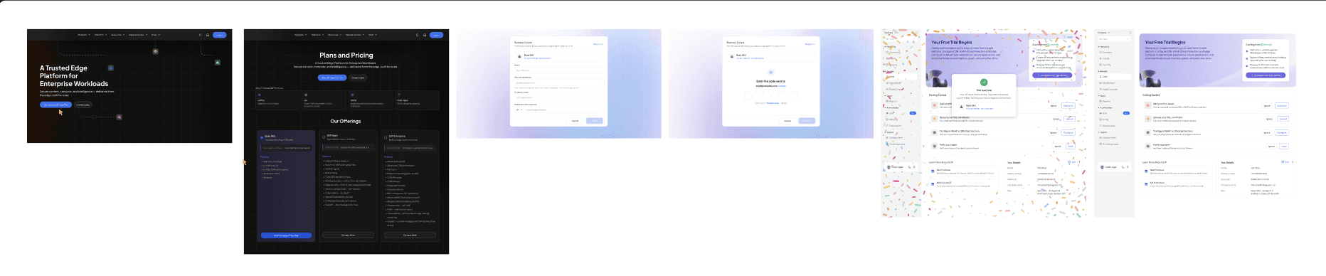
Trial workflow
Prospect signs up (self-service, corporate-domain verified, email-OTP)
Lands on "Your Free Trial Begins" screen
Sees getting-started checklist: add first asset → upload SSL certificate → configure WAAP/DDoS → invite team
Each step actionable or dismissible, no forced order
Trial runs 30 days, no SLA, no support commitment
On conversion: MACD order upgrades SKU, config carries over, "nothing you've configured will be lost"
On non-conversion: services auto-disabled at day 30
User lands on Dashboard (Business or Operations view, based on role)
Business view: reads AI Executive Summary first → drops into supporting metrics if verifying
Operations view: scans Active Attacks and Rule Hits → pivots between Traffic/Security/Edge Compute tabs as needed
If a direct question comes up, opens Ask Sen instead of digging through tables
Ask Sen available from anywhere in the dashboard, not tied to one section
Design
From Insight to Interface
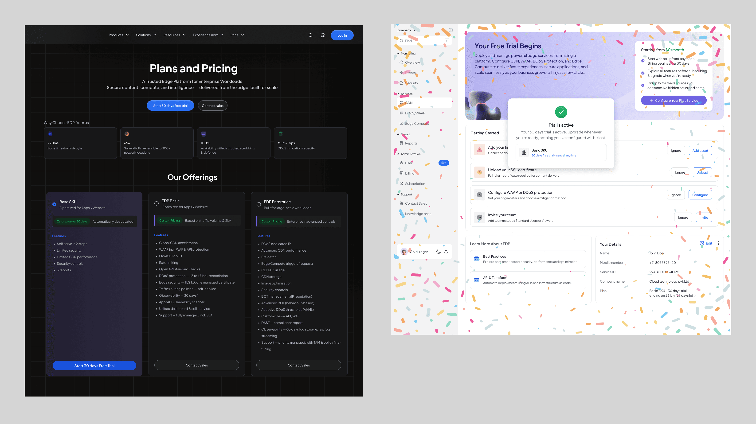
Trial
Leads with $0/month pricing to remove cost anxiety upfront
Getting-started checklist instead of a rigid wizard: add first asset, upload SSL, configure WAAP/DDoS, invite team
Each step independently actionable or dismissible - user controls pace
Answers the "still evaluating" fear - no commitment before seeing value
Details/plan status kept low-priority, available but not competing for attention
Operations Dashboard
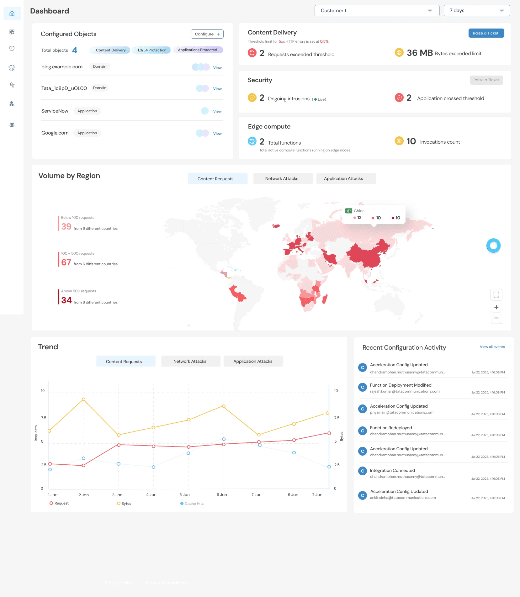
Version 1
Keeping every single service seperate.
The dashboard does not look cohesive.
Volume by region has no significant.
Recent configuration can only happened for CDN and other services does not have this capability, so we decided to remove it.
AI option feel hidden while floating on the dashboard.
If one service is not configured the dashboard can look very empty.
Version Final
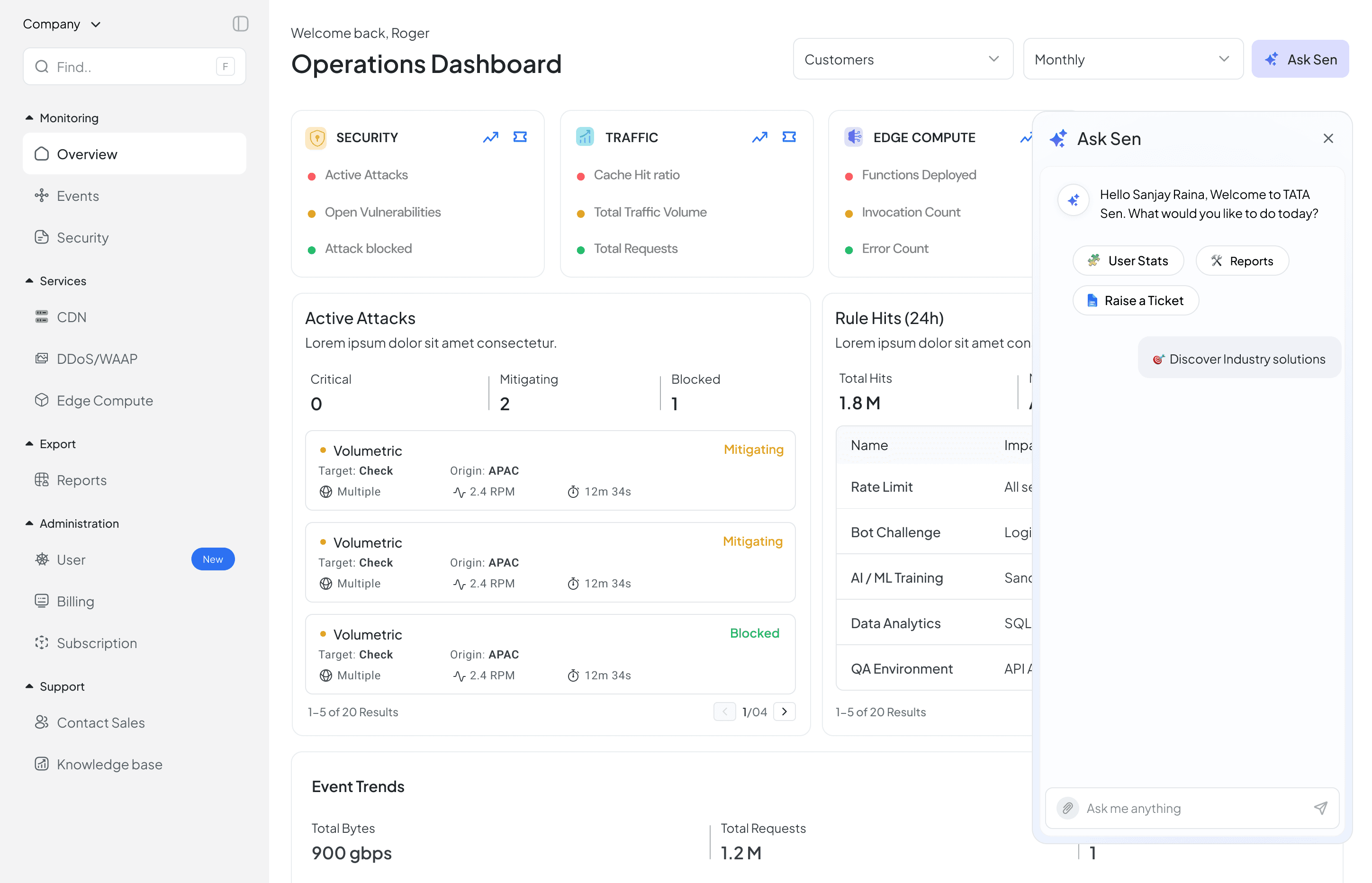
Each threat shows just enough context (target, origin, rate, duration) to act without leaving the page
Active Attacks triaged by severity (Critical / Mitigating / Blocked), not a flat list
Rule Hits pairs impact with billing period, connects security decisions to cost
Tabbed Event Trends (Traffic & Performance / Security / Edge Compute), one view, no navigating away
Built for someone monitoring multiple things at once, not a single linear flow

Business Dashboard
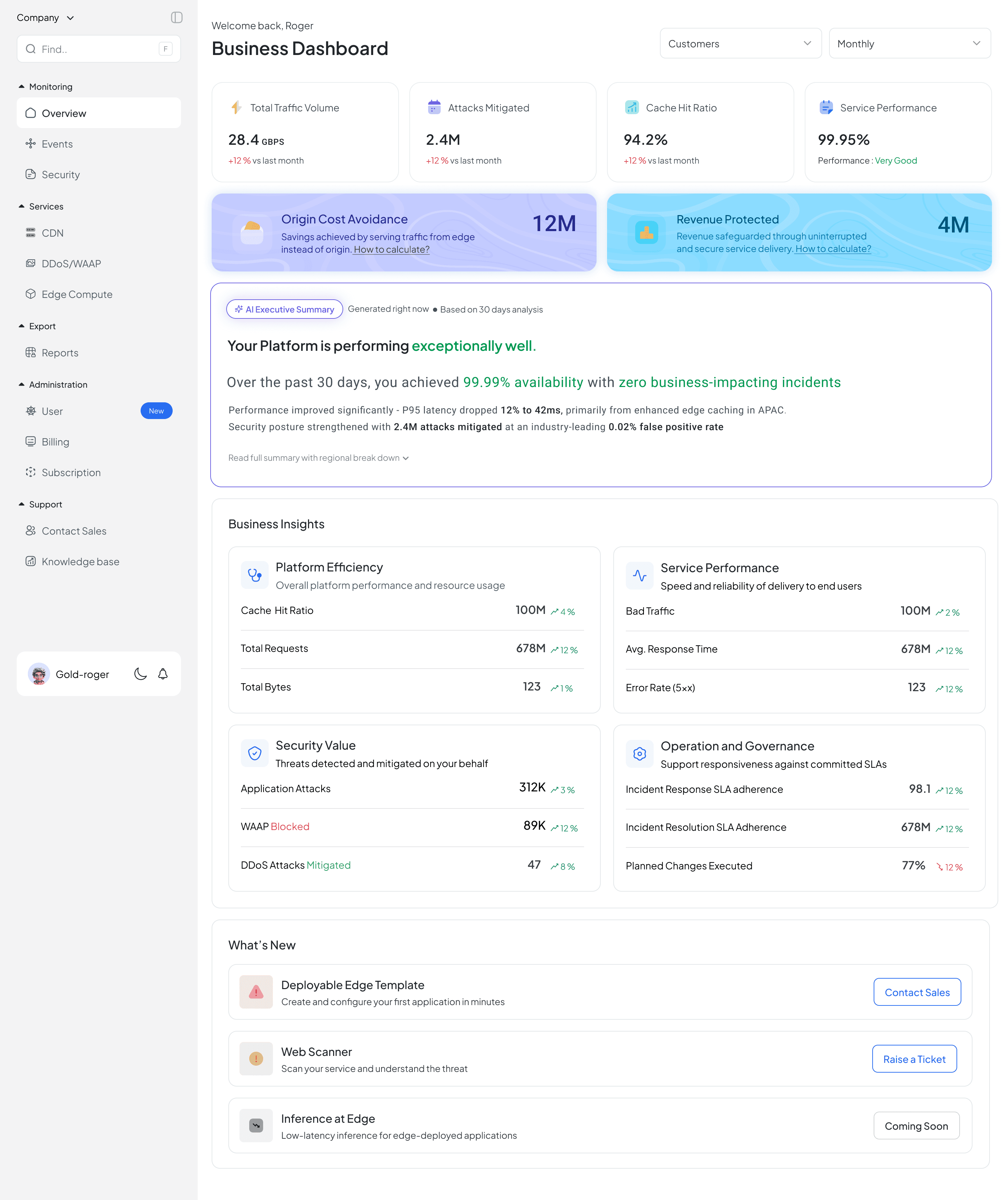
AI Executive Summary sits above all raw metrics
Timestamped and sourced ("Generated right now, 30 days analysis") — signals it isn't generic
Explains cause, not just outcome (e.g. latency drop tied to APAC edge caching) — makes the AI claim feel earned
Hero metrics (Origin Cost Avoidance, Revenue Protected) paired with "How to calculate?" links for verification
Business Insights grouped by outcome (Platform Efficiency, Security Value, Governance) — matches how stakeholders think, not how systems are organized
Ask Sen (Chatbot)
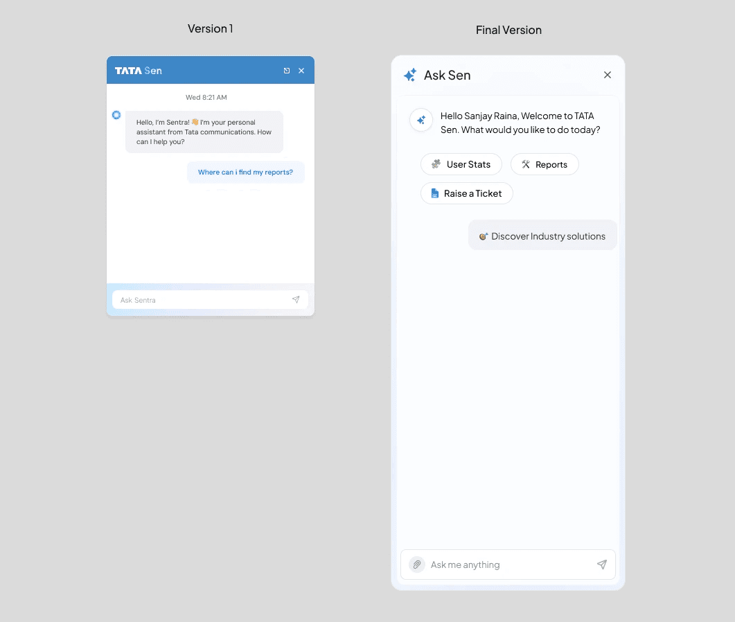
Designed for scalability – The interface can easily accommodate future AI capabilities and additional quick actions.
Introduced an AI escalation flow – Passive dashboard insights lead seamlessly to active AI assistance for deeper analysis.
Enabled active AI assistance – Users can ask questions and receive contextual help on demand, complementing the dashboard's passive insights.
Improved discoverability – Frequently used actions are surfaced as quick actions for faster access.
Enhanced usability – A larger input field and clear "Ask me anything" prompt encourage interaction and make the AI easier to use.
Navigation
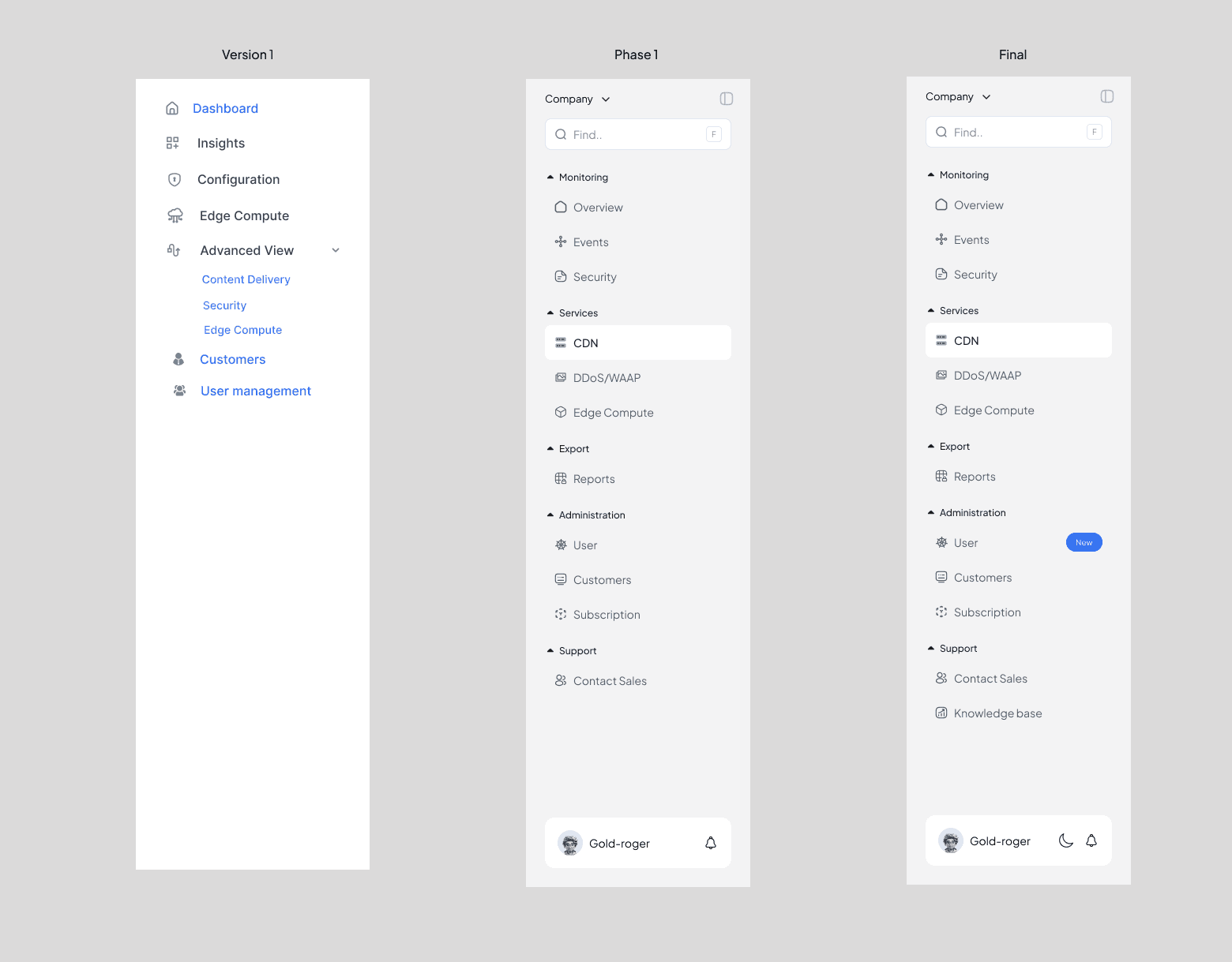
Why I changed from Version 1 to Final
Better Information Architecture - Grouped related features under clear sections (Monitoring, Services, Administration, Support) instead of showing a long flat menu.
Improved Discoverability - Added a search bar so users can quickly find pages without scrolling.
Reduced Cognitive Load - Used collapsible categories to make the navigation cleaner and easier to scan.
Scalable Navigation - The new structure supports adding more products and features without cluttering the sidebar.
Clear Product Hierarchy - Services like CDN, DDoS/WAAP, and Edge Compute are grouped together, making relationships obvious.
Faster Navigation - Frequently used items are easier to locate because content is logically organized.
Enhanced User Experience - Added profile, notifications, theme switcher, and company selector for better account management.
Improved Visual Hierarchy - Better spacing, section headers, and active states help users identify where they are.
Support & Help Access - Introduced Knowledge Base and Contact Sales for quicker assistance.
Future-Ready Design - The sidebar is modular, making it easier to maintain and expand as the platform grows.
Reflection
What worked and what I learned
Testing & Validation
Validated through stakeholder review and PM validation workflows
PM and stakeholders reviewed flows against PRD requirements and real onboarding constraints (30-day trial, self-service signup, role permissions)
Iterative feedback loop: design → stakeholder review → refine, repeated across trial, Business Dashboard, and Operations Dashboard
Reflections — What This Project Taught Me
🔹 AI sped up first-draft synthesis and exploration, hours, not days
Real design decisions (IA, trust, hierarchy) stayed human, Figma and judgment shaped what shipped
On a solo, greenfield project, AI acted as a force multiplier, not a replacement
Leaned on stakeholder validation over user testing, a fair tradeoff for a new product, but a known gap