Tata Communications
2026
Building a Scalable Design System That Enabled 34% Faster Development & 40% Better Consistency
Designed a scalable design system for Tata Communications’ complex enterprise SaaS products, bringing fragmented UI patterns into one unified framework. The system helped teams build and ship faster while creating a more consistent experience across the platform.
Overview
Scaling consistency across complex enterprise products
At Tata Communications, multiple product experiences and complex enterprise workflows made consistency increasingly important. As the product evolved, teams needed a shared design foundation to reduce repetitive work, align patterns, and maintain a cohesive experience. The design system created a common language for design and development, helping teams move faster while improving product quality and consistency.
The Challenge
Maintaining consistency while scaling fast
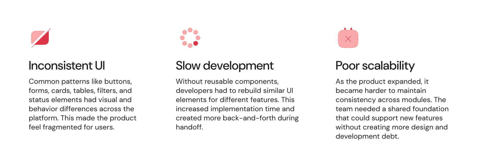
Tata Communications was scaling its digital product ecosystem across multiple enterprise solutions and teams. As new features were added, teams often created similar components and patterns independently, resulting in inconsistent experiences, repeated work, and slower design-to-development handoffs.
The challenge was to create a shared design foundation that could support different products and use cases while making design and development faster, more consistent, and easier to scale.
Identifying gaps through design audit
Auditing the product to identify what needed to be standardized
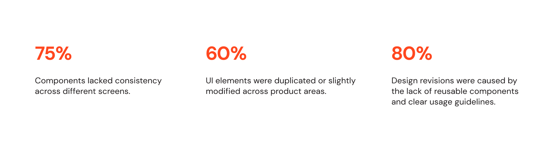
Before building the design system, I audited Tata Communications’ existing products and interfaces to identify recurring patterns and inconsistencies. The audit helped uncover gaps across components, typography, spacing, colors, and interaction patterns , showing where teams were solving similar problems differently.
It provided a clear foundation for defining what needed to be standardized, reused, and scaled across the product ecosystem.
Key metrics
Audit insights
📌 Screens had inconsistent typography, color usage, spacing, and button styles.
📌 Common UI elements were often recreated with small differences, which made the product harder to maintain.
📌 The absence of design tokens created inconsistencies in spacing, colors, typography, radius, and component states.
The audit helped define the first set of priorities for the design system and gave the team a clear reason to move toward a shared component library.
Driving design system adoption
Showing the value beyond reusable components
At Tata Communications, adoption was not just about introducing a component library. The system needed to solve real problems for designers and developers by reducing rework, improving handoffs, and making common design decisions faster.
I focused on showing how the system could support everyday workflows and help teams deliver faster without compromising consistency.
Design approach
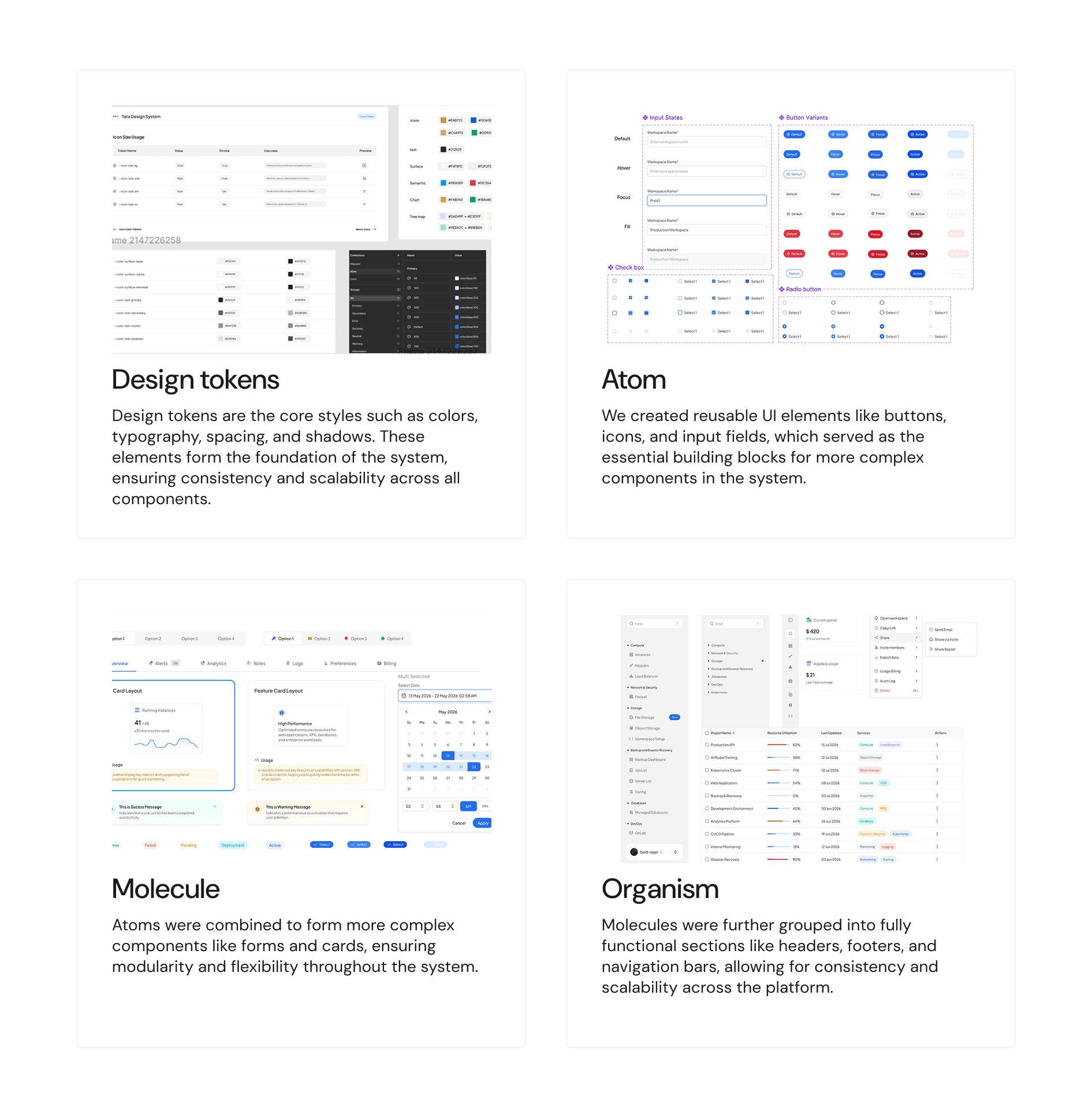
Building the system from foundations to reusable product patterns
Standardizing reusable UI patterns
I built a reusable component library for Tata Communications, focusing on patterns that appeared frequently across its enterprise products and workflows. The goal was to create a consistent foundation without limiting teams working across different product needs.
The components translated common design decisions into reusable patterns for both design and development, making it easier for designers to work faster, giving engineers clearer specifications, and reducing repeated UI work.
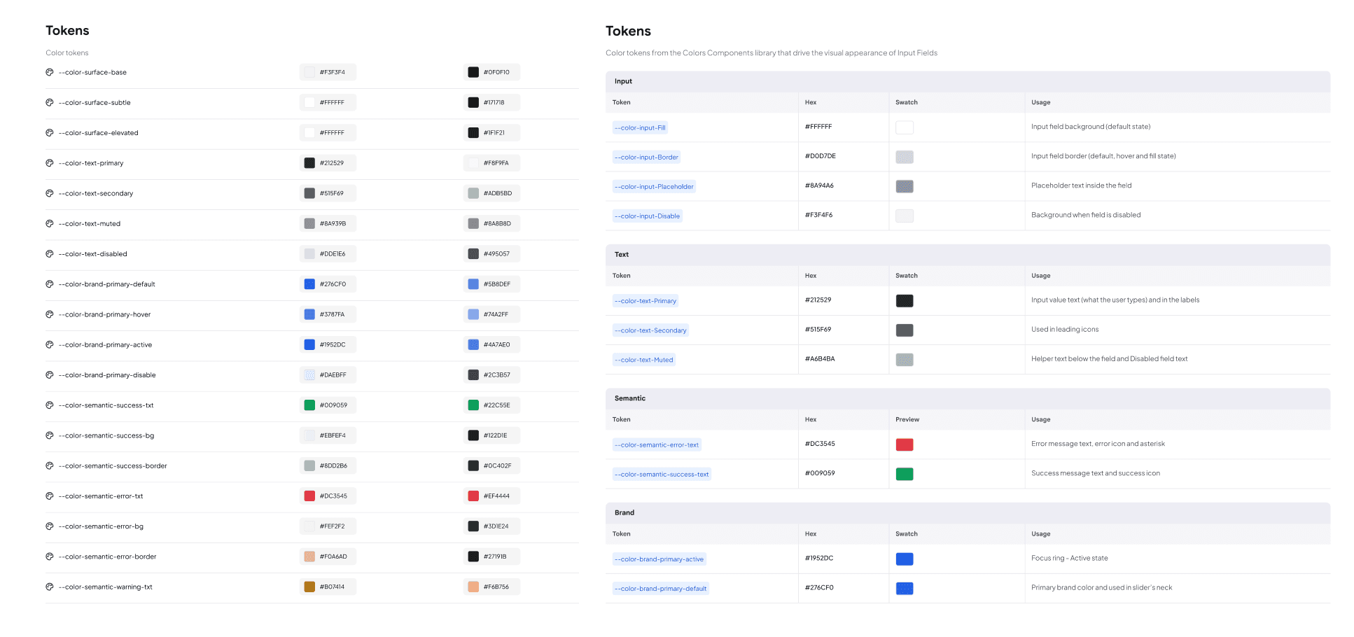
Tokens
I structured the design tokens to create a clear and scalable system rather than using raw values across components.
Primitive tokens: Defined the core values such as colors, spacing, typography, radius, and sizing.
Semantic tokens: Mapped those values to their purpose, such as
color.text.primary,color.background.surface,color.border.default, andcolor.action.primary.Component tokens: Used semantic tokens at the component level to define properties like button background, text, border, hover, disabled, and focus states.
Naming structure: Followed a consistent hierarchy of
category → purpose → state,making tokens easier to find and understand.Standardization: Established shared values and naming conventions so designers and developers used the same definitions across products.
Easy to update: Because components referenced tokens instead of hardcoded values, a change to a core or semantic token could be reflected across multiple components without updating each one manually.
This created a more predictable, maintainable, and scalable foundation for Tata Communications’ design system.
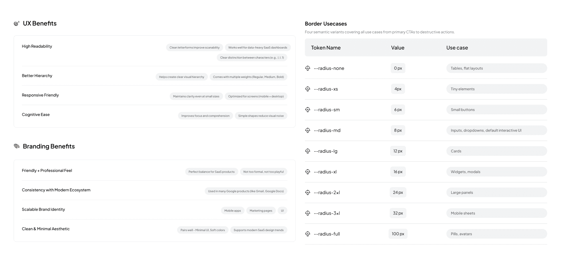
Benefits and Use cases
I documented the purpose, benefits, and use cases for each part of the system. This helped teams understand not only what to use, but also when and why to use it.
Typography: Defined hierarchy and use cases for headings, body text, labels, and supporting text.
Colors: Documented semantic roles such as primary, secondary, success, warning, error, and neutral, along with where each should be used.
Components: Mapped common use cases and behaviours for each component. For Example border-radius tokens defined consistent usage from small UI elements to inputs, cards, widgets, and larger containers.
This made the design system more than a component library. It became a practical reference for making consistent design decisions across Tata Communications’ products.
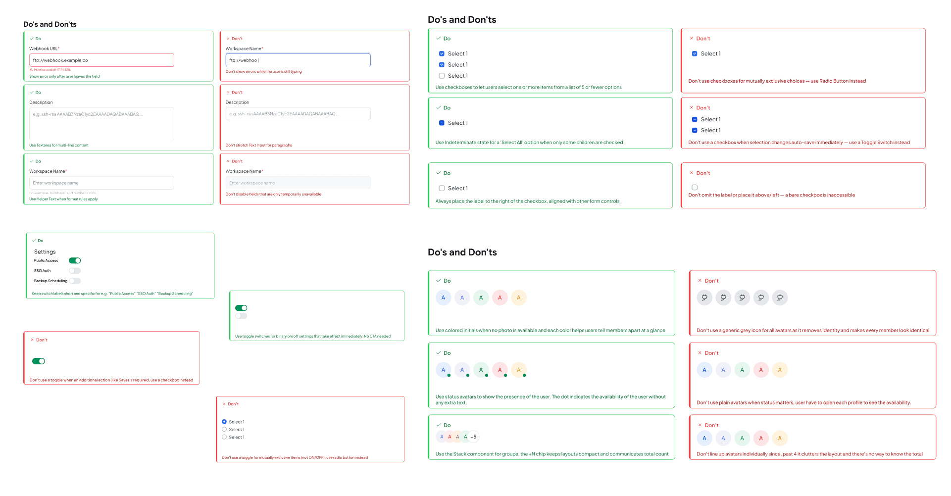
Do's and Don'ts
Clear guidelines were created to help teams use components correctly and maintain consistency across products.
Clear usage: Defined when and where each component should be used.
Consistent behavior: Standardized interaction patterns across products.
State guidance: Documented correct usage for default, hover, focus, disabled, and error states.
Avoid misuse: Highlighted common mistakes and inconsistent implementations.
Better handoff: Gave developers a shared reference for implementation.
Overall, these guidelines reduced ambiguity and helped teams make faster, more consistent design decisions.
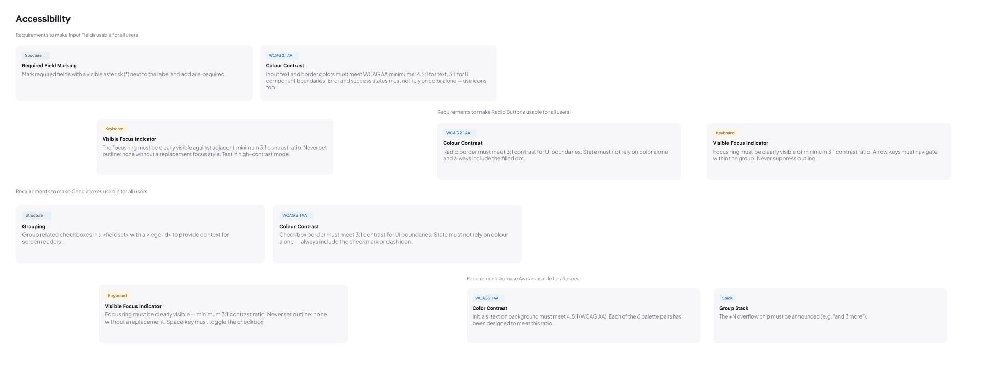
Accessibility
Built accessibility guidelines into the design system to make components usable and inclusive across Tata Communications’ products.
WCAG compliance: Defined minimum colour contrast requirements for text, borders, and UI elements.
Keyboard access: Added clear focus indicators and keyboard navigation guidance.
Form accessibility: Defined required-field marking and accessible labels for screen readers.
Component states: Ensured states like error, success, selected, and disabled were not communicated through colour alone.
Screen reader support: Included guidance for grouping, labels, and dynamic content.
This made accessibility a built-in part of the system, rather than something added later.
Collaboration with development
“Worked with cross-functional development teams to turn the design system into reusable, production-ready components.”
Outcomes
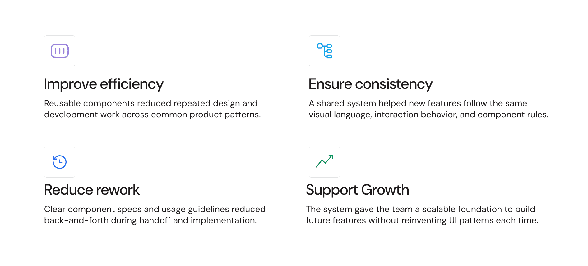
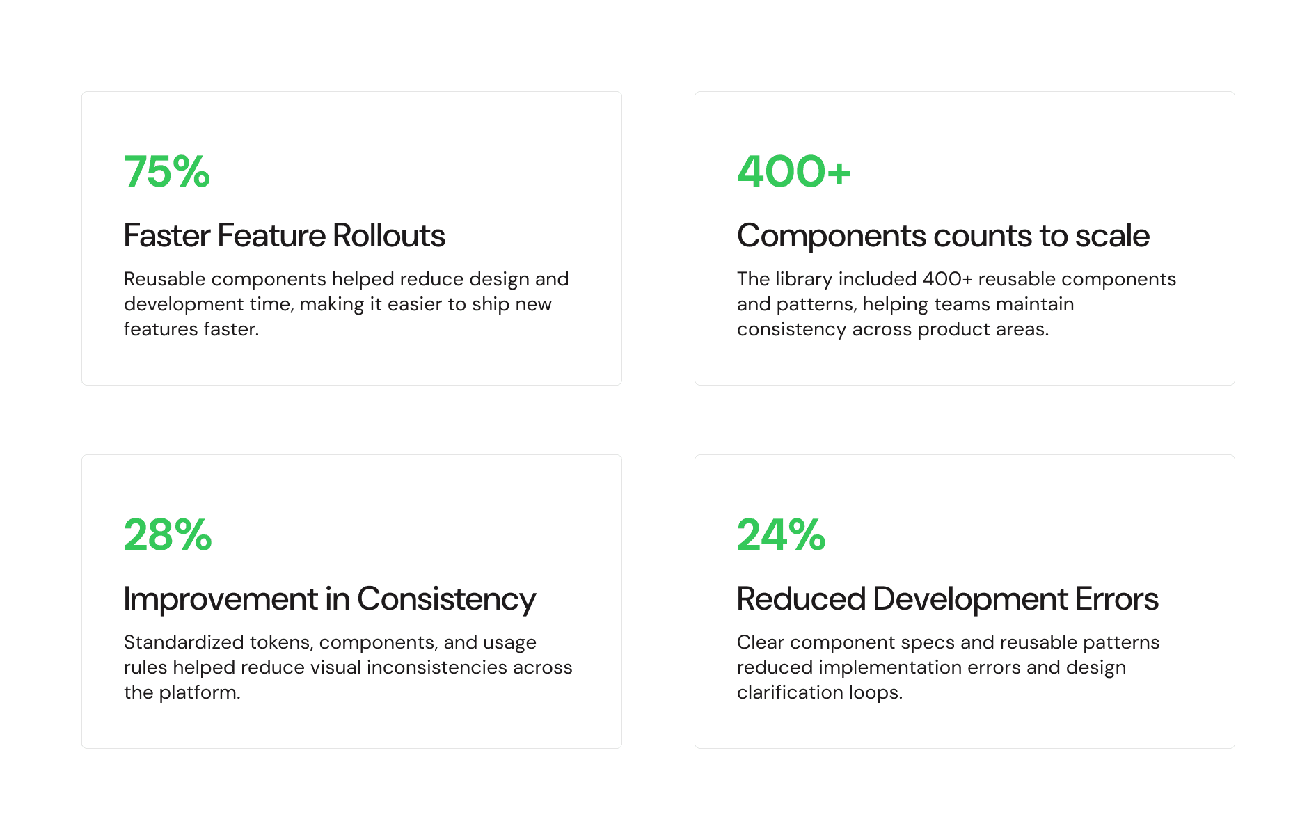
The system reduced rework while improving consistency across product areas.
Learnings
Building the Tata Communications design system taught me that a successful design system is as much about people and processes as it is about components.
⭐️ Early Buy-In is Crucial - Aligning stakeholders early helped establish the system’s value and encouraged adoption.
⭐️ Collaboration Across Teams is Key - Working closely with design, development, and QA helped make the system practical and production-ready.
⭐️ Design for Scalability - Creating flexible foundations made it easier to support new products, features, and workflows.
⭐️ Design for Real Use Cases - Components work best when they solve actual product problems rather than existing as isolated UI elements.